Making Maps using Cartopy
Cartopy is a Python map plotting package. Combined with matplotlib is works well for making contour plots of maps for Climate Data Analysis
This notebook will demonstrate how to make map contour plots using Cartopy, including: 1. some stuff 2. some more stuff
Data
We return to our CMIP5 data for surface air temperature (tas) from the RCP8.5 scenario produced by the NCAR/CCSM4 model. For this example, we will again read the first ensemble member.
The data are located on the COLA severs in the following directory: /shared/cmip5/data/rcp45/atmos/mon/Amon/tas/NCAR.CCSM4/r1i1p1/
The filename is: tas_Amon_CCSM4_rcp45_r1i1p1_210101-229912.nc
[1]:
import warnings

import numpy as np
import xarray as xr
import pandas as pd
import matplotlib.pyplot as plt

import cartopy.crs as ccrs
import cartopy.mpl.ticker as cticker
from cartopy.util import add_cyclic_point
Read Data
[2]:
path='/shared/cmip5/data/rcp45/atmos/mon/Amon/tas/NCAR.CCSM4/r1i1p1/'
fname='tas_Amon_CCSM4_rcp45_r1i1p1_200601-210012.nc'
ds=xr.open_dataset(path+fname)
ds
[2]:
<xarray.Dataset>
Dimensions:    (bnds: 2, lat: 192, lon: 288, time: 1140)
Coordinates:
  * time       (time) object 2006-01-16 12:00:00 ... 2100-12-16 12:00:00
  * lat        (lat) float64 -90.0 -89.06 -88.12 -87.17 ... 88.12 89.06 90.0
  * lon        (lon) float64 0.0 1.25 2.5 3.75 5.0 ... 355.0 356.2 357.5 358.8
    height     float64 ...
Dimensions without coordinates: bnds
Data variables:
    time_bnds  (time, bnds) object ...
    lat_bnds   (lat, bnds) float64 ...
    lon_bnds   (lon, bnds) float64 ...
    tas        (time, lat, lon) float32 ...
Attributes:
    institution:                  NCAR (National Center for Atmospheric Resea...
    institute_id:                 NCAR
    experiment_id:                rcp45
    source:                       CCSM4
    model_id:                     CCSM4
    forcing:                      Sl GHG Vl SS Ds SA BC MD OC Oz AA
    parent_experiment_id:         historical
    parent_experiment_rip:        r1i1p1
    branch_time:                  2005.0
    contact:                      cesm_data@ucar.edu
    references:                   Gent P. R., et.al. 2011: The Community Clim...
    initialization_method:        1
    physics_version:              1
    tracking_id:                  0bf35136-b266-44d2-9078-f3081b83b6ad
    acknowledgements:             The CESM project is supported by the Nation...
    cesm_casename:                b40.rcp4_5.1deg.001
    cesm_repotag:                 ccsm4_0_beta49
    cesm_compset:                 BRCP45CN
    resolution:                   f09_g16 (0.9x1.25_gx1v6)
    forcing_note:                 Additional information on the external forc...
    processed_by:                 strandwg on mirage0 at 20111021
    processing_code_information:  Last Changed Rev: 428 Last Changed Date: 20...
    product:                      output
    experiment:                   RCP4.5
    frequency:                    mon
    creation_date:                2011-10-21T21:56:22Z
    history:                      2011-10-21T21:56:22Z CMOR rewrote data to c...
    Conventions:                  CF-1.4
    project_id:                   CMIP5
    table_id:                     Table Amon (26 July 2011) 976b7fd1d9e1be31d...
    title:                        CCSM4 model output prepared for CMIP5 RCP4.5
    parent_experiment:            historical
    modeling_realm:               atmos
    realization:                  1
    cmor_version:                 2.7.1
Let’s take the mean temperature over the entire period for our plots
[3]:
ds_mean=ds.mean(dim='time')
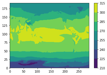
Previously, in the read-netcdf notebook, we just used plt.contour from matplotlib, like this:
[4]:
plt.contourf(ds_mean['tas'])
plt.colorbar()
[4]:
<matplotlib.colorbar.Colorbar at 0x7f4c5501f710>
Plot with a map
However, we would like to plot this with map and control the map projection, label the lats and lons, etc.
[5]:
# Make the figure larger
fig = plt.figure(figsize=(11,8.5))

# Set the axes using the specified map projection
ax=plt.axes(projection=ccrs.PlateCarree())

# Make a filled contour plot
ax.contourf(ds['lon'], ds['lat'], ds_mean['tas'],
            transform = ccrs.PlateCarree())

# Add coastlines
ax.coastlines()
[5]:
<cartopy.mpl.feature_artist.FeatureArtist at 0x7f4c54f48e10>
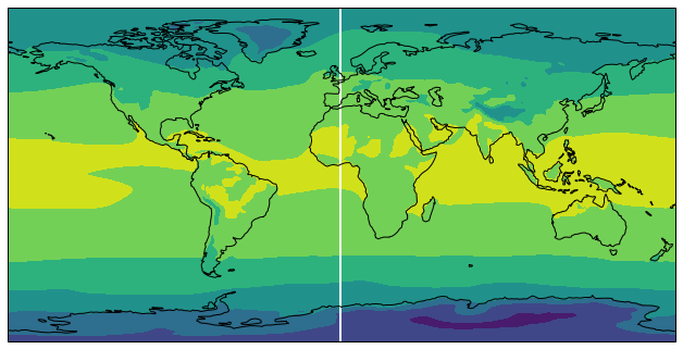
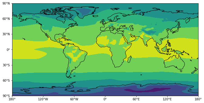
Cyclic data and lat-lon labels
This figure has a couple of things we would like to change: 1. The stripe at 0 lon. This is due to the fact that contourf has no way to know that our data is cyclic in longitude. We will fix this using cartopy.util.add_cyclic_point 2. No lat-lon labels. We will add lat-lon labels using set_x(y)ticks and cticker.
We set the lat-lon lables using set_x(y)ticks and cticker. We will fix the white strip using
[6]:
# Make the figure larger
fig = plt.figure(figsize=(11,8.5))

# Set the axes using the specified map projection
ax=plt.axes(projection=ccrs.PlateCarree())

# Add cyclic point to data
data=ds_mean['tas']
data, lons = add_cyclic_point(data, coord=ds['lon'])


# Make a filled contour plot
cs=ax.contourf(lons, ds['lat'], data,
            transform = ccrs.PlateCarree())

# Add coastlines
ax.coastlines()

# Define the xticks for longitude
ax.set_xticks(np.arange(-180,181,60), crs=ccrs.PlateCarree())
lon_formatter = cticker.LongitudeFormatter()
ax.xaxis.set_major_formatter(lon_formatter)

# Define the yticks for latitude
ax.set_yticks(np.arange(-90,91,30), crs=ccrs.PlateCarree())
lat_formatter = cticker.LatitudeFormatter()
ax.yaxis.set_major_formatter(lat_formatter)
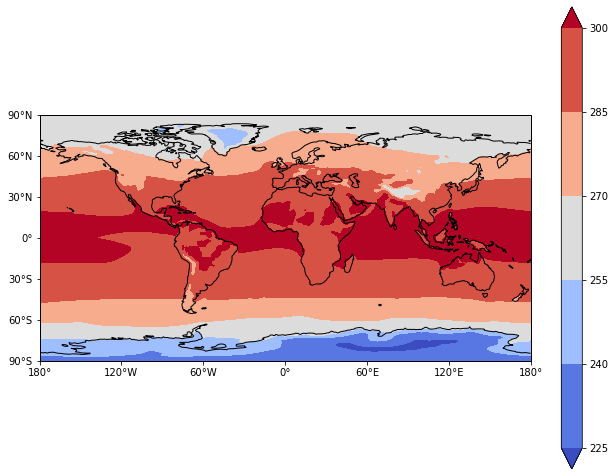
Change the Colormap
The colors are not very nice for plotting temperature contours. Let’s choose a different colormap and add a colorbar. The [colormap options] https://matplotlib.org/3.1.1/gallery/color/colormap_reference.html come from matplotlib. I will choose one called coolwarm
[7]:
# Make the figure larger
fig = plt.figure(figsize=(11,8.5))

# Set the axes using the specified map projection
ax=plt.axes(projection=ccrs.PlateCarree())

# Add cyclic point to data
data=ds_mean['tas']
data, lons = add_cyclic_point(data, coord=ds['lon'])


# Make a filled contour plot
cs=ax.contourf(lons, ds['lat'], data,
            transform = ccrs.PlateCarree(),cmap='coolwarm',extend='both')

# Add coastlines
ax.coastlines()

# Define the xticks for longitude
ax.set_xticks(np.arange(-180,181,60), crs=ccrs.PlateCarree())
lon_formatter = cticker.LongitudeFormatter()
ax.xaxis.set_major_formatter(lon_formatter)

# Define the yticks for latitude
ax.set_yticks(np.arange(-90,91,30), crs=ccrs.PlateCarree())
lat_formatter = cticker.LatitudeFormatter()
ax.yaxis.set_major_formatter(lat_formatter)

# Add colorbar
cbar = plt.colorbar(cs)
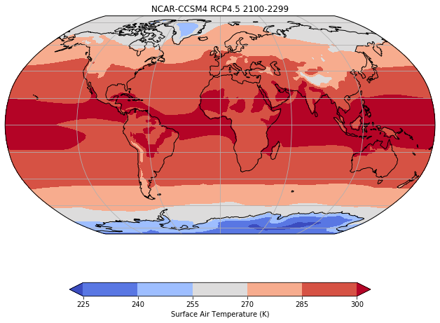
Change the map projection
What if I want to use a different map projection? The various map projections can be found here https://scitools.org.uk/cartopy/docs/latest/crs/projections.html
[8]:
# Make the figure larger
fig = plt.figure(figsize=(11,8.5))

# Set the axes using the specified map projection
ax=plt.axes(projection=ccrs.Robinson())

# Add cyclic point to data
data=ds_mean['tas']
data, lons = add_cyclic_point(data, coord=ds['lon'])


# Make a filled contour plot
cs=ax.contourf(lons, ds['lat'], data,
            transform = ccrs.PlateCarree(),cmap='coolwarm',extend='both')

# Add coastlines
ax.coastlines()

# Add gridlines
ax.gridlines()

# Add colorbar
cbar = plt.colorbar(cs,shrink=0.7,orientation='horizontal',label='Surface Air Temperature (K)')

# Add title
plt.title('NCAR-CCSM4 RCP4.5 2100-2299')
[8]:
Text(0.5, 1.0, 'NCAR-CCSM4 RCP4.5 2100-2299')