Read a file from an remote OPeNDAP server and make a contour plot of the data
In this example, we demonstrate: 1. How to read a netcdf file in Python using xarray from a remote OPeNDAP server 2. How to make a contour plot of the data
Data
We will read data from the North American Multi-model Ensemble (NMME) database. Specifially, we will read the sea surface temperature (SST) data hindcast data for the COLA-RSMAS-CCSM4 model.
The NMME public database is hosted on the International Research Institute for Climate and Society (IRI) data server http://iridl.ldeo.columbia.edu/SOURCES/.Models/.NMME/
Python import statements
You must first import the Python packages you wish to use. This is a common set of basic import statments you can start with.
[7]:
import numpy as np
import xarray as xr
import matplotlib.pyplot as plt
Set the path and filename
[8]:
url = 'http://iridl.ldeo.columbia.edu/SOURCES/.Models/.NMME/.COLA-RSMAS-CCSM4/.MONTHLY/.sst/dods'
Read the data using xarray open_dataset http://xarray.pydata.org/en/stable/generated/xarray.open_dataset.html
[9]:
ds =xr.open_dataset(url, decode_times=False)
When you read in data using xarray, it creates an object called an xarray.Dataset which consists of your data and all its metadata. If we print out our Dataset which is called ds, its similar to doing a ncdump -h on a netcdf file. You can see all the dimensions, size, and attributes of the data in the file.
[10]:
ds
[10]:
<xarray.Dataset>
Dimensions:  (L: 12, M: 10, S: 457, X: 360, Y: 181)
Coordinates:
  * S        (S) float32 264.0 265.0 266.0 267.0 ... 717.0 718.0 719.0 720.0
  * X        (X) float32 0.0 1.0 2.0 3.0 4.0 ... 355.0 356.0 357.0 358.0 359.0
  * M        (M) float32 1.0 2.0 3.0 4.0 5.0 6.0 7.0 8.0 9.0 10.0
  * L        (L) float32 0.5 1.5 2.5 3.5 4.5 5.5 6.5 7.5 8.5 9.5 10.5 11.5
  * Y        (Y) float32 -90.0 -89.0 -88.0 -87.0 -86.0 ... 87.0 88.0 89.0 90.0
Data variables:
    sst      (S, L, M, Y, X) float32 ...
Attributes:
    Conventions:  IRIDL
If you want to access just the surface air tempeature (tas) data itself, without all the gloal attributes, you can do that by supplying the name of the variable
[11]:
ds['sst']
[11]:
<xarray.DataArray 'sst' (S: 457, L: 12, M: 10, Y: 181, X: 360)>
[3573374400 values with dtype=float32]
Coordinates:
  * S        (S) float32 264.0 265.0 266.0 267.0 ... 717.0 718.0 719.0 720.0
  * X        (X) float32 0.0 1.0 2.0 3.0 4.0 ... 355.0 356.0 357.0 358.0 359.0
  * M        (M) float32 1.0 2.0 3.0 4.0 5.0 6.0 7.0 8.0 9.0 10.0
  * L        (L) float32 0.5 1.5 2.5 3.5 4.5 5.5 6.5 7.5 8.5 9.5 10.5 11.5
  * Y        (Y) float32 -90.0 -89.0 -88.0 -87.0 -86.0 ... 87.0 88.0 89.0 90.0
Attributes:
    defaultvalue:   720.0
    pointwidth:     0
    long_name:      Sea Surface Temperature
    cell_methods:   time: mean
    units:          Celsius_scale
    spatial_op:     Conservative remapping: 1st order: destarea: NCL: /homes/...
    lat:            89.5
    standard_name:  sea_surface_temperature
    expires:        1580517720
The NMME data dimensions correspond to the following: X=lon,L=lead,Y=lat,M=ensemble member, S=initialization time.
matplotlib plt.contourf function for a filed contour plot. It works very similar to Matlab plotting functions.[12]:
plt.contourf(ds['sst'][0,0,0,:,:])
plt.colorbar()
[12]:
<matplotlib.colorbar.Colorbar at 0x7f28e4d47438>
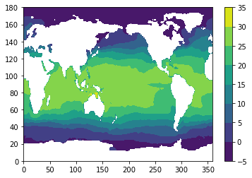
This is a very simple plot, but it looks like we have global temperature data. More details on how to plot maps, make nice lables, and colors, can be found in other examples.