Making Plots Using Matplotlib
matplotlib is a Python plotting package that has similar features to Matlab
Website: https://matplotlib.org/
This notebook will demonstrate some of the features of matplotlib common for Climate Data Analysis plotting, including:
How to make a line plot and make it look nice with labels and colors
How to make multiple plots together using subplot
Data
We will use data on the COLA Servers from SubX in which I have previously calculated the daily skill of the Real-time Multivariate MJO Index (RMM), two indices that together represent the Madden-Julian Oscillation, for many different SubX models.
The data are located on the COLA Servers in the directory: /project/predictability/kpegion/subx/data/analysis/skill/
The files are called: skill.accrmse.MODELNAME.rmm.daily.nc
where MODELNAME refers to one of the SubX models
[1]:
import warnings

import numpy as np
import xarray as xr
import pandas as pd
import matplotlib.pyplot as plt
[2]:
def get_model_name(fname):
    return modelname
Set the directory and filename
[3]:
path='/project/predictability/kpegion/subx/data/analysis/skill/'
fname='skill.accrmse.*.rmm.daily.nc'
Read in the data for all models using xr.open_mfdataset()
[4]:
rmm_ds=xr.open_mfdataset(path+fname,concat_dim='model',combine='nested')
As you can see, we now have a bunch of skill scores for each model. We will focus on bivarcorr, which is the bivariate correlation and is commonly used to measure the skill of the RMM indices combined into a single measure.
You may also notice that we have only 1 latitude and 1 longitude, as this is only an skill score for an index. Thus, we can use the squeeze function to drop these unimportant dimensions.
[5]:
rmm_ds=rmm_ds.squeeze()
rmm_ds
[5]:
<xarray.Dataset>
Dimensions:    (model: 6, time: 45)
Coordinates:
    lat        float32 -90.0
    lon        float32 0.0
  * time       (time) datetime64[ns] 1960-01-02 1960-01-03 ... 1960-02-15
Dimensions without coordinates: model
Data variables:
    accrmm1    (model, time) float32 dask.array<chunksize=(1, 45), meta=np.ndarray>
    accrmm2    (model, time) float32 dask.array<chunksize=(1, 45), meta=np.ndarray>
    rmsermm1   (model, time) float32 dask.array<chunksize=(1, 45), meta=np.ndarray>
    rmsermm2   (model, time) float32 dask.array<chunksize=(1, 45), meta=np.ndarray>
    bivarcorr  (model, time) float32 dask.array<chunksize=(1, 45), meta=np.ndarray>
    bivarrmse  (model, time) float32 dask.array<chunksize=(1, 45), meta=np.ndarray>
    perr       (model, time) float32 dask.array<chunksize=(1, 45), meta=np.ndarray>
    aerr       (model, time) float32 dask.array<chunksize=(1, 45), meta=np.ndarray>
Attributes:
    title:         SubX Anomalies
    long_title:    SubX Anomalies
    comments:      SubX project http://cola.gmu.edu/~kpegion/subx/
    institution:   IRI
    source:        SubX IRI
    CreationDate:  2018/09/12 17:50:23
    CreatedBy:     kpegion
    MatlabSource:  calcdailyskilltest
As you can see, the dimensiion model exists, but has no definition. Our xr.Dataset does not know the model names, but we can add them.
[6]:
modelnames=['CCSM4-RSMAS','FIMr1p1-ESRL','GEFS-EMC','GEM-ECCC',
            'GEOS_V2p1-GMAO','NESM-NRL']
rmm_ds['model']=modelnames
rmm_ds
[6]:
<xarray.Dataset>
Dimensions: (model: 6, time: 45)
Coordinates:
lat float32 -90.0
lon float32 0.0
* time (time) datetime64[ns] 1960-01-02 1960-01-03 ... 1960-02-15
* model (model) <U14 'CCSM4-RSMAS' 'FIMr1p1-ESRL' ... 'NESM-NRL'
Data variables:
accrmm1 (model, time) float32 dask.array<chunksize=(1, 45), meta=np.ndarray>
accrmm2 (model, time) float32 dask.array<chunksize=(1, 45), meta=np.ndarray>
rmsermm1 (model, time) float32 dask.array<chunksize=(1, 45), meta=np.ndarray>
rmsermm2 (model, time) float32 dask.array<chunksize=(1, 45), meta=np.ndarray>
bivarcorr (model, time) float32 dask.array<chunksize=(1, 45), meta=np.ndarray>
bivarrmse (model, time) float32 dask.array<chunksize=(1, 45), meta=np.ndarray>
perr (model, time) float32 dask.array<chunksize=(1, 45), meta=np.ndarray>
aerr (model, time) float32 dask.array<chunksize=(1, 45), meta=np.ndarray>
Attributes:
title: SubX Anomalies
long_title: SubX Anomalies
comments: SubX project http://cola.gmu.edu/~kpegion/subx/
institution: IRI
source: SubX IRI
CreationDate: 2018/09/12 17:50:23
CreatedBy: kpegion
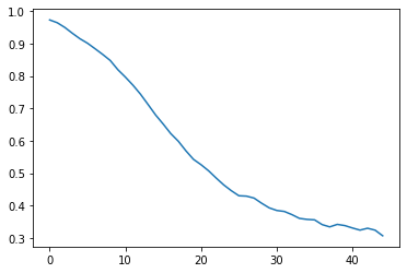
MatlabSource: calcdailyskilltestNow we will plot the skill of the first model for all lead times as a line plot
[7]:
plt.plot(rmm_ds['bivarcorr'][0,:])
[7]:
[<matplotlib.lines.Line2D at 0x7f8330cf8128>]
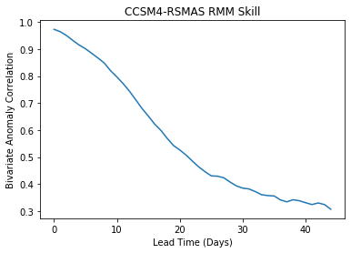
Axis Labels and Title
[8]:
plt.plot(rmm_ds['bivarcorr'][0,:])
plt.title(modelnames[0]+' RMM Skill')
plt.xlabel('Lead Time (Days)')
plt.ylabel('Bivariate Anomaly Correlation')
[8]:
Text(0, 0.5, 'Bivariate Anomaly Correlation')
Controlling the Axis intervals
You can control the axis intervals by specifying them in plt.xticks or plt.yticks
[9]:
x=np.arange(0,45,5)
y=np.arange(0,1,0.1)
plt.plot(rmm_ds['bivarcorr'][0,:])
plt.title(modelnames[0]+' RMM Skill')
plt.xlabel('Lead Time (Days)')
plt.xticks(x)
plt.yticks(y)
[9]:
([<matplotlib.axis.YTick at 0x7f8330ac3710>,
  <matplotlib.axis.YTick at 0x7f8330ac3048>,
  <matplotlib.axis.YTick at 0x7f8330b1a828>,
  <matplotlib.axis.YTick at 0x7f8330a71a58>,
  <matplotlib.axis.YTick at 0x7f8330a71f28>,
  <matplotlib.axis.YTick at 0x7f8330a77438>,
  <matplotlib.axis.YTick at 0x7f8330a77908>,
  <matplotlib.axis.YTick at 0x7f8330a77dd8>,
  <matplotlib.axis.YTick at 0x7f8330a77eb8>,
  <matplotlib.axis.YTick at 0x7f8330a716d8>],
 <a list of 10 Text yticklabel objects>)
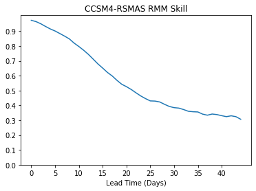
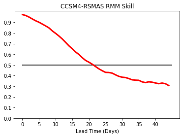
Change color and thickness, add horizontal line
[10]:
x=np.arange(0,45,5)
y=np.arange(0,1,0.1)
plt.plot(rmm_ds['bivarcorr'][0,:],color='r',linewidth=3.0)
plt.hlines(0.5,0,45)
plt.title(modelnames[0]+' RMM Skill')
plt.xlabel('Lead Time (Days)')
plt.xticks(x)
plt.yticks(y)
[10]:
([<matplotlib.axis.YTick at 0x7f8330d3f940>,
  <matplotlib.axis.YTick at 0x7f8330d2fba8>,
  <matplotlib.axis.YTick at 0x7f8330aa2b70>,
  <matplotlib.axis.YTick at 0x7f8330d11cc0>,
  <matplotlib.axis.YTick at 0x7f8330d043c8>,
  <matplotlib.axis.YTick at 0x7f8330d150b8>,
  <matplotlib.axis.YTick at 0x7f8330d15470>,
  <matplotlib.axis.YTick at 0x7f8330cbe0b8>,
  <matplotlib.axis.YTick at 0x7f8330cbe940>,
  <matplotlib.axis.YTick at 0x7f8330cbe7f0>],
 <a list of 10 Text yticklabel objects>)
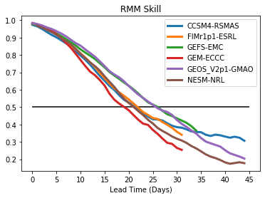
Multiple lines on the same plot with legend
[11]:
# Loop over all the models and plot
for i,model in enumerate(rmm_ds['model'].values):
    x=np.arange(0,46,5)
    y=np.arange(0,1.1,0.1)
    plt.plot(rmm_ds['bivarcorr'][i,:],linewidth=3.0)
    plt.xticks(x)
    plt.yticks(y)

# Add labels, legend, hline
plt.title('RMM Skill')
plt.xlabel('Lead Time (Days)')
plt.legend(modelnames)
plt.hlines(0.5,0,45)
[11]:
<matplotlib.collections.LineCollection at 0x7f8330cd1cc0>
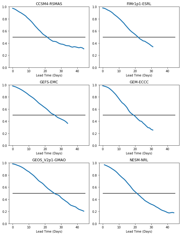
Multiple plots on a page
We will loop over all the models and make an individual plot for each model, with all plots being on the same page. We will make use of the plt.subplot function in which you specify plt.subplot(#rows,#columns, plot#), which defines a grid of subplots on the page. The plots are thenfilled across rows first, then columns to fill out the grid.
Here is an example using our RMM skill for all the models. In this case, we have specified then number of rows and columns manually to make it easy to understand, but this could easily be generaized
[12]:
# We have 6 models to plot, so we will specify 3 rows x 2 columns
nrows=3
ncols=2
[13]:
# Define the figure size for a
#portrait 8.5 x 11 in page (e.g. like for a paper)
plt.figure(figsize=(8.5,11))

# Loop over all models and plot
for i,model in enumerate(rmm_ds['model'].values):
    plt.subplot(nrows,ncols,i+1)
    x=np.arange(0,46,5)
    y=np.arange(0,1.1,0.1)
    plt.plot(rmm_ds['bivarcorr'][i,:],linewidth=3.0)
    plt.xticks(x)
    plt.yticks(y)
    plt.title(model)
    plt.xlabel('Lead Time (Days)')
    plt.hlines(0.5,0,45)
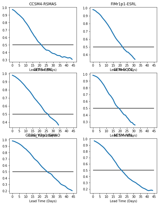
There are two problems with this plot: 1. We have overlap between the titles and the xaxis labels. We will fix this using plt.tight_layout() 2. The plots have different ranges for the y-axis. We will fix this using plt.ylim()
[14]:
# Define the figure size for a
#portrait 8.5 x 11 in page (e.g. like for a paper)
plt.figure(figsize=(8.5,11))

# Loop over all models and plot
for i,model in enumerate(rmm_ds['model'].values):
    plt.subplot(nrows,ncols,i+1)
    plt.ylim(0,1.0)
    x=np.arange(0,45,5)
    y=np.arange(0,1,0.1)
    plt.plot(rmm_ds['bivarcorr'][i,:],linewidth=3.0)
    x=np.arange(0,46,5)
    y=np.arange(0,1.1,0.1)
    plt.title(model)
    plt.xlabel('Lead Time (Days)')
    plt.hlines(0.5,0,45)
    plt.tight_layout()